
Contact Us
Let’s Partner for Your Next Big Presentation
Consult with our Business Advisor
.webp)
Thank you! Your submission has been received!
Oops! Something went wrong while submitting the form.

You've Updated the Deck. Why Hasn't the Win Rate Changed?
Every quarter, the same cycle occurs. We do a content update. Value proposition refined. A new success story added to slide 9. The pricing was revised. Two rounds of presentation. We send it to prospective customers, warm leads, a shortlisted RFP, and our win rate does not move.
The problem is not content. It is the absence of business presentation redesign.
When a business presentation is presented, a potential customer forms an impression of your organization immediately, based purely on its visual aspect even before one word is spoken. As per Justuno research, consumers use visuals as a means of decision-making 93 percent of the time. A powerful presentation trapped in poor design may lose a sale on substance. But that’s not why it lost the customer; it is because the company lost credibility and the prospect did not tell you so.
A business presentation redesign changes the functionality of the deck - visual hierarchies, information architecture, data visualization logic, and narrative structure.
A content refresh informs the recipient that the data is updated. Business presentation redesign informs the prospect of the importance and significance that the company places on how information is conveyed. Brand consistency research has proven that a consistent visual representation of your brand can increase your bottom line by up to 23%. The sales deck is one of those touchpoints where your brand leaves an impression. It should be consistent with your website, proposal, and other business materials. No number of content revisions will fix an inconsistency in your presentation design.
Here are the key differences briefly stated:
Impressions of visual credibility are made in 50 milliseconds, which happens faster than conscious thinking does. Even before reading your first slide, your prospect will have decided whether the presentation comes from an authoritative and credible company, one worth hearing out. A poor design of the cover slide immediately creates a credibility deficit that will haunt the rest of the deck.
This is why an impactful business presentation slides should always treat its cover as important as all other slides. This isn't about making things fancy. This is about sending an important message, one that only gets to send once.
Every time your audience has to make an effort to understand your slides, deciphering the crowded graph, interpreting what figure is significant, figuring out how to read text that should have been one headline, they use energy that could otherwise have been used to evaluate your proposal. Unconsciously, your audience associates their effort in comprehending your slides with their expected effort working with you.
Subconsciously, your audience will associate the difficulty of understanding your slides with the difficulty of doing business with you.
Professional presentation redesign deals with this problem using the concept of hierarchy: one key message per slide, data visualization showing the point immediately, and consistent visual grammar guiding your audience.
Personalized slides have been found to increase user engagement with the sales deck by 33%, according to Storydoc. But this level of customization can only be achieved if a proper design foundation is put in place. Using an ad hoc template to personalize slides results in an inconsistent presentation.
When you have a properly redesigned set of presentation slides that can be adjusted easily, personalizing content is a routine task, which is one of the most powerful presentation design ideas that lead directly to commercial success.
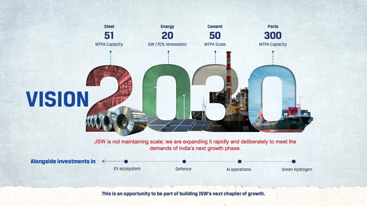
Aditya Birla Capital: Modular Design for Leadership Communication
A 35-slide leadership narrative. An 8-day deadline. A CEO with the challenge of communicating his 3 pillars strategically to a room that would not tolerate any ambiguity.
An average sales deck is viewed by 3.7 viewers internally in one organization. One of them attended the meeting in person. Other people viewing your presentation did so cold, with no presenter providing necessary context and no relationship helping them. They're assessing your company based on the presentation material alone.
A deck designed for a follow-up situation, where each slide makes its own statement, data-driven slides deliver conclusions, not information, and a visual hierarchy helps the viewer assess the material independently of a presenter makes conversions possible even without presenting the deck yourself. A deck designed to work even without being presented converts even after you closed your computer.
Hindustan Coca-Cola Beverages Leaders' Meet 2025: Built to Work Without a Presenter
A leadership audience, most of whom would never be in the live presentation room.
The sales process in B2B is very prolonged. Your potential customer might come across your brand at your website, a proposal, a capabilities document, and even at a QBR session over days or even months. Should there be inconsistency in the visual style used for any of these materials, it will negatively affect the other materials.
Innovative business presentation design shouldn’t be different every single time. Research has found that 73% of people trust brands more when their visuals are consistent throughout all touch points.
When a deck is designed to look professional, clean fonts, clear hierarchy, and guiding data, viewers aren't just impressed by "pretty slides". They subconsciously consider the numbers on those slides more credible. The strategy appears more robust. The request sounds more reasonable. The company seems more competent.
According to Stanford, 75% of people determine credibility of a business simply by looking at visuals. In B2B sales, most of the decision-makers never attend the presentation. Instead, they are sent the slides via email, look at them on their phones, spend less than two minutes analyzing, and make a decision. This decision will determine whether they become an advocate of the proposal.
Deloitte SAPM 2025: CEO Keynote for Senior Partners
The CEO keynote for senior partners in the environment of a multi-screen space, 17,000+ pixels wide, where every visual choice would be analyzed by some of the most sophisticated minds in the business.
Very few companies ever get direct feedback about their decks being problematic. The clients will tell you "We're going in a different direction" instead of "Your slides looked too generic". These are the signs you should pay attention to:
Deterioration of attention after slide three – the opening wasn't structured to establish credibility, everything else will fight against this problem.
Success when presenting the idea, but failure when following up - You've presented successfully, but when removing you from the equation, the conversion rate drops – the deck was designed to work only with you.
Multiple people contributed to the presentation by adding new slides – ad hoc growth leads to design inconsistency that will be noticed, although not necessarily understood.
Presentation looks too generic on a mobile device – the trend of using mobile devices and making business presentations more attractive is no more optional.
Reskinning is not redesign. Putting a new color theme on an already designed deck doesn't solve problems with its structure.
Everything begins with rethinking the architecture of a presentation. The first question we need to answer is "What do we want the viewers to believe after seeing our slides?". Everything else - layout, sequence, what to take away, will stem from answering this one question.
Hierarchy before design. Each slide needs to be given a role. What's the main message of this slide? Is it visually obvious enough?
Data-driven visualization of information. All charts are rebuilt around the conclusion. The title states the verdict; the annotation supports it.
Systemic approach to design. Not just a redesigned deck but a design system that can evolve further, without the designer. Presentation ideas and creative design tips from a presentation designer that turn your one-time redesign into a long-lasting competitive advantage: templates for your teams to edit your slides without breaking consistency.
Two versions of each presentation: the one to use during the talk, the other one, leave-behind, that can stand on its own, and close a deal without you.
.webp)
.webp)

If you've answered “no” to more than two, you've got a business presentation redesign challenge, not a content issue.
Great content in a poorly designed presentation is like a great product in bad packaging. Your product doesn't change, but now all its impressions are forever colored by what your package conveyed before they even opened it up.
The impression your prospects form of your company's competence and professionalism from the moment they open your deck is critical. Improving the aesthetics of business presentations is a welcome side effect; improving conversion rates is the primary objective. Ensure that all the visual cues you send through your deck, before a word is ever read, serve the cause of conversion, not fight against it.
The firms that know this approach their sales deck like an asset that needs to be engineered, not a document that needs to be updated. In terms of win rates and deal size over the year, this difference is not insignificant.
Co-founder of INKPPT, I specialize in transforming complex ideas into refined, visually striking presentations. With a deep belief in the power of storytelling and design, I help brands communicate with clarity, purpose, and impact. Every slide is crafted to inform, inspire, and leave a lasting impression.

About the Author


Consult with our Business Advisor